|
Wednesday, 6 April 2011
Tuesday, 5 April 2011
Trailer finished and complete!
After the feedback we got last week, we altered lots of things, fine tuning the trailer and adding finishing touches. We are really happy with what we produced and have tried to get as much response from our target audience as possible, so hoping what we have made is successful.
Thursday, 24 March 2011
Trailer feedback
In today's lesson we showed our media class our trailer on the projector screen. We handed out a questionnaire [pictured above] for everyone to fill out and collect some feedback in order for us to know what needs improving. We are going to take these remarks on board and edit our trailer, hopefully producing the final cut.
What is the name of our film?
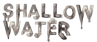
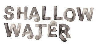
The majority of people left this answer blank as the trailer doesn't actually feature our title. We know this is probably the most important thing to be in the trailer which is why we are going to get it in asap. We are going to use the handmade watery font which colleen produced herself, we hope it will be one of the iconic features of our film.
What's our production name?
All but a few people answered this correct, its featured at the very beginning of our trailer. In one of the later questions someone said it could be shown for longer, so we may slow it down by a second or two.
What Genre is it?
Everybody said the film genre was horror which is correct. This shows that our trailer has lots of horror connotations and links to the genre well.
What makes you think this?
The most popular answer given was the fast, jolty editing. People said the long shots built tension and contrasted well with the jump cuts. The fast flickering gives a sense of instability and fractured personalities. This was our purpose and therefore has worked well as nearly everybody commented on this. A few people said makeup and costume added to the horror genre, dark colours which also worked well with the dark lighting.
What do you think of the backing track?
We had a good response to our music, people said it was eerie and fitted well with our editing. They said it built tension with the calm music at the beginning and the loud bangs at the end. We were really happy with the music and are glad the audience felt the same, we intended for the loudest bits to be at the end on dramatic parts of the footage.
What could be improved?
- an apostrophe needs to be put in
- possibly more dialogue
- title text
- the text to be on screen for a bit longer
These are the main points which came up, we are going to take them all into consideration when editing the trailer next time.
What didn't you like?
People said the ending was an anti climax, and ended suddenly. We do already know this and intend to add a scream and fade to black to finish. They also felt the storyline could have been clearer, so we need to work on this and make it more clear.
What did you like?
We had similar answers here to the 'what makes you think this' question which in my eyes makes it a success. The music and editing were popular answers again and people said they work well for the genre which means we have a good horror trailer!
Some people also liked the unconventional setting of the beach and pier. They said it wasnt expected but worked in its own creepy way.
Rating out of 10?
the average rating was an 8 which is pretty good, hopefully we can get this up to a 10 after some more editing and our final trailer.
Trailer
This is our trailer, the first finished edit which we are now going to show people for feedback. enjoy.
Thursday, 17 March 2011
Final Trailer week 1
Following on from the last post, we have been working more on our trailer. We have changed and added a lot but kept the basic structure from before.
To start with we added a green preview screen which instantly made the trailer look more professional. This is then followed by a group of establishing shots, which pan and fade into each other, similarly to before. The shots create a sense of familiarity with the audience, getting them to know where the trailer is set. Using an overlay we have added text which backs up the idea of our killer being dazed and confused as shown in our poster [here]. We have added the music we chose (Seme) which helped our editing dramatically, there was a drop in the song so we switched from calm editing to quick cuts of the killer and a sink, linking to the water theme.
We have added in lots of footage of tom, one of the victims, looking into mirrors which have the infinity effect. This shows his feelings, scared and afraid but duplicates it over and over, highlighting it to the audience. It shows his fractured being which is added to by the 2 super quick jump cuts of the killer - seeming like its in his mind and he is thinking about her. The trailer ends on a shot of the pier with a mysterious figure, the camera zooming in bit by bit which seems quite stalker like. This gives a sense of being watched and fits well with horror conventions.
The trailer is coming on quite quickly now, hopefully just a few weeks until it is done and ready for feedback.
20seconds
This is our first attempt at editing our actual trailer and taking it seriously. We have only produced 20 seconds but believe it has potential and could be made longer for the final outcome.
We have used some establishing shots to start with which fade into each other, creating equilibrium which horror films usually do, making the viewer feel comfortable. We have then put in a close up of a couples hand, which reinforces the equilibrium and introduces the victim characters. After this the tempo starts to speed up with a scream from one of the characters we have just seen. We used a hand held camera shot on a canted angle to create disorientaion - contrasting the previous shots. This is one of our favourite shots but maybe it could be moved further through the trailer to have more impact on the audience.
Next we have introduced a short, sharp shot of our villain in the water. The quick editing adds to the mood of the film and the jump cuts create panic. Using a shot of her in the water links the film back to the title and makes the audience want to know why she is there and wahts going to happen. We then added in a close up of her face as she snaps open her eye which is freaky and makes the viewer jump.
The music cuts in and although not typical horror music, it definaltey helps the trailer along. In the real trailer we will use the music we have researched and picked [here] but for now this is just an experiment. We then added in some quick, simple text on a black backgroud - following horror connotations and following on from this we have a clip of Tom looking over his shoulder and 'watching his back' like the text suggested.
We are happy with this so far and think with some more film added in and some slight alterations we have a good start!
3D Poster
3D seems to be very popular in the cinemas at the moment and we decided to give it a go, making our poster look 3d when wearing the special glasses. We followed the following steps on a photoshop tutorial:
Although the 3D idea had potential, we don't think it works very well and therefore have decided against using it! For the 3D image to work you need the red and cyan shadow layers, but due to the colours in our image the cyan layer didn't seem to work. I think with some further development maybe just having the title text in 3D could work better. This would be a more subtle version of 3D but would mean the title would really stand out and capture audience attention. I have proeduced an example of this below which would then be placed onto the poster, replacing the current title. We think the simplicity of only one element being 3D has much more power and effect on the audience,
- Put your image in Photoshop
- Duplicate this layer, creating a new layer
- Create two blank layers and place then in-between the artwork layers
- Colour top layer to Blue
- Colour next layer to red
- Turn red and blue layers to 'screen' in blend mode
- Merge down the top two layers
- Convert this layer to 'multiply'
- Finally move this layer and look through your glasses to get the right position for it to be 3D
[please put on 3D glasses now]
This is the outcome we got...
Although the 3D idea had potential, we don't think it works very well and therefore have decided against using it! For the 3D image to work you need the red and cyan shadow layers, but due to the colours in our image the cyan layer didn't seem to work. I think with some further development maybe just having the title text in 3D could work better. This would be a more subtle version of 3D but would mean the title would really stand out and capture audience attention. I have proeduced an example of this below which would then be placed onto the poster, replacing the current title. We think the simplicity of only one element being 3D has much more power and effect on the audience,
Thursday, 3 March 2011
Music
Today we started editing our trailer and realized we need to find some music in order to edit in time with the soundtrack. We started by searching for horror music on the internet but everything seemed to cheesy and more comical horror than realistic. We then decided to look into real horror soundtracks for music that is professional and fits the genre. Dark Water, The Strangers and The Grudge had some promising tracks which were dramatic and suitable for our trailer, we narrowed it down to three tracks: see below.
We have chosen to use Seme, from The Grudge score as our trailer music. We liked all the tracks but felt this had the most potential and worked well with our storyline. The other two tracks have some good dramatic parts within the music but we feel Seme had the best tune. The song has a good amount of low music with some dramatic drops that are well spaced apart. This will be good for when editing the trailer to the music, we can use the quiter parts to build tension and the louder bits for shocking the audience.
We have chosen to use Seme, from The Grudge score as our trailer music. We liked all the tracks but felt this had the most potential and worked well with our storyline. The other two tracks have some good dramatic parts within the music but we feel Seme had the best tune. The song has a good amount of low music with some dramatic drops that are well spaced apart. This will be good for when editing the trailer to the music, we can use the quiter parts to build tension and the louder bits for shocking the audience.
Thursday, 17 February 2011
Briony's Poster
This is my poster which i produced using adobe photoshop. I have used an image that we took whilst at the beach (our location) which we felt had the most potential. The image itself is quite light and airey but Colleens body language is quite odd and almost disorentated which gives the viewer a distressed feeling. We felt this work well with our film, being more of a physcological thrill than gory horror. The image doesn't reveal much about the character so the audience is left intrigued... who is she?... whiy is she in the sea?... why is she looking into the distance? This is the type of hype we want our film to create and we think the poster does this well.
Thursday, 10 February 2011
Title
We experimented with lots of downloaded fonts from www.dafont.com and got feedback from others in our class as they are the age of our potential target audience. We got a lot of positive feedback, especially on the more simple fonts with slight water effects which link to our name 'Shallow Water'. People expressed that some of the fonts we had chosen were a bit too 'cheesy' in the theme of horror and became more comical than scary. Although we did have some good digital fonts, we thought we could do better so decided to use our graphic skills and produce our own title. Colleen hand painted some lettering with watercolour which has a blotted feel, reflecting our movie Shallow Water. She used black and white paint, blending it and watering it down which made it look quite dark and creepy. After some further comment's we realised this wasn't overly scary so wanted to play with the idea of blood and dripping. Using Photoshop Colleen added drips to some of the letters, but only a few so that it wasn't over done. This looked creepier than before but still didn't communicate the idea of blood. We then altered the colours, hue and saturation to give it a red tint. This automatically became a lot more striking and gave the image of blood in water, symbolising death, danger and horror. I am really pleased with what we produced and think it's an idividual twist on our trailer

Thursday, 27 January 2011
Font Ideas...
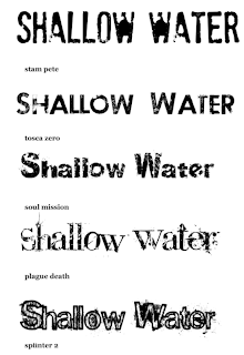
 The font is very important for a movie poster, one of the main recognizable features which is why we are taking time to carefully select our type face. We have used www.dafont.com to source a selection of fonts which we like and are going to ask our fellow students which they think will suit our horror film best. The fonts we have chosen are mainly quite simple, with fractured, erroded and splattered effects. We decided against a type face which is too elaborate as it can become cheesy and after some research found that most other horror films use simple type.
The font which got the most amount of votes was number 4. People said they liked that it was quite a traditional font which is recognisable, mixed with splatters of paint which reminded them of blood. They also said the splatters were like water and the sea splashing...which links well to our water themed film.
Number 2 was also popular, very simple sans serif font with a brushed eroded effect. The audience said it was very clearly readable and bold with a hint of scary.
Number 5 was the least popular, people felt it was slightly to over worked... the stroke and the splatters were a bit too much. Also someone said the font was very rounded which made it very friendly looking.
I think these are all valid points and have helped us with making the decision.
Monday, 17 January 2011
Magazine Covers

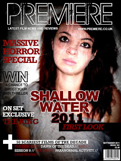
These are our magazine covers, both quite similar. On colleen's version of the magazine cover (left) although using the same main image, she has edited the brightness and contrast of the image to crate an apparent paled face killer - a typical image you'd expect to see within a horror. The image is more spooky than Briony's (right). Both covers have used the black red and white colour scheme, these are traditional horror colours - sticking the genre conventions. The tag lines on both are also quite similar, main one being about our movie itself... Briony's linking with the name 'Premiere' with the idea of first look and seeing it before others. We have both made the magazine a horror special because after some research we found that movie magazines dont often have horror films on the cover, we believe this is to do with age rating and it appealing to a smaller audience. So by creating it a special, the audience will know its just a one off. We have used words such as 'exclusive', 'win', 'behind the scenes' etc as these are all things which appeal to the audience, making them feel like they are getting something extra and involving them in the magazine.
We are both happy with the two posters and are submitting both of them for the exam, we think they look quite proffesional and work well with our other media products!
We are both happy with the two posters and are submitting both of them for the exam, we think they look quite proffesional and work well with our other media products!
Wednesday, 12 January 2011
Photoshoot
We have taken a range of images for our film poster and magazine cover. We experimented with a range of shot ideas which could be edited and developed. These were inspired by other movie posters we researched - we hope the images represent our film well and give the audience a sneak peek into our trailer itself. Photos can be found at our flickr or by clicking the photos below. We want the poster to be quite scary, featuring the killer and maybe a weapon or some blood (making her look like a killer). But we don't want it to be over the top creepy as this may put some viewers off and give to much away! I think the photos we have taken have potential and could look good after editing :)
Subscribe to:
Posts (Atom)


