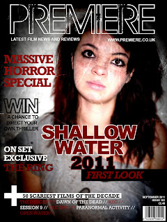
These are our magazine covers, both quite similar. On colleen's version of the magazine cover (left) although using the same main image, she has edited the brightness and contrast of the image to crate an apparent paled face killer - a typical image you'd expect to see within a horror. The image is more spooky than Briony's (right). Both covers have used the black red and white colour scheme, these are traditional horror colours - sticking the genre conventions. The tag lines on both are also quite similar, main one being about our movie itself... Briony's linking with the name 'Premiere' with the idea of first look and seeing it before others. We have both made the magazine a horror special because after some research we found that movie magazines dont often have horror films on the cover, we believe this is to do with age rating and it appealing to a smaller audience. So by creating it a special, the audience will know its just a one off. We have used words such as 'exclusive', 'win', 'behind the scenes' etc as these are all things which appeal to the audience, making them feel like they are getting something extra and involving them in the magazine.
We are both happy with the two posters and are submitting both of them for the exam, we think they look quite proffesional and work well with our other media products!
We are both happy with the two posters and are submitting both of them for the exam, we think they look quite proffesional and work well with our other media products!

No comments:
Post a Comment