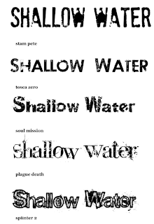
 The font is very important for a movie poster, one of the main recognizable features which is why we are taking time to carefully select our type face. We have used www.dafont.com to source a selection of fonts which we like and are going to ask our fellow students which they think will suit our horror film best. The fonts we have chosen are mainly quite simple, with fractured, erroded and splattered effects. We decided against a type face which is too elaborate as it can become cheesy and after some research found that most other horror films use simple type.
The font which got the most amount of votes was number 4. People said they liked that it was quite a traditional font which is recognisable, mixed with splatters of paint which reminded them of blood. They also said the splatters were like water and the sea splashing...which links well to our water themed film.
Number 2 was also popular, very simple sans serif font with a brushed eroded effect. The audience said it was very clearly readable and bold with a hint of scary.
Number 5 was the least popular, people felt it was slightly to over worked... the stroke and the splatters were a bit too much. Also someone said the font was very rounded which made it very friendly looking.
I think these are all valid points and have helped us with making the decision.
No comments:
Post a Comment