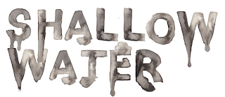
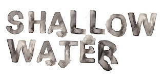
We experimented with lots of downloaded fonts from www.dafont.com and got feedback from others in our class as they are the age of our potential target audience. We got a lot of positive feedback, especially on the more simple fonts with slight water effects which link to our name 'Shallow Water'. People expressed that some of the fonts we had chosen were a bit too 'cheesy' in the theme of horror and became more comical than scary. Although we did have some good digital fonts, we thought we could do better so decided to use our graphic skills and produce our own title. Colleen hand painted some lettering with watercolour which has a blotted feel, reflecting our movie Shallow Water. She used black and white paint, blending it and watering it down which made it look quite dark and creepy. After some further comment's we realised this wasn't overly scary so wanted to play with the idea of blood and dripping. Using Photoshop Colleen added drips to some of the letters, but only a few so that it wasn't over done. This looked creepier than before but still didn't communicate the idea of blood. We then altered the colours, hue and saturation to give it a red tint. This automatically became a lot more striking and gave the image of blood in water, symbolising death, danger and horror. I am really pleased with what we produced and think it's an idividual twist on our trailer


No comments:
Post a Comment